— MY ROLE
Creative Direction
Visual Identity Design
Brand Strategy
Copy-Writing
One of the first projects I tackled upon joining the Redroc team was a complete re-branding of the agency itself.
Background:
At the time of my arrival in the summer of 2017, Redroc was a 23 year old full-service advertising agency with a stellar reputation for results-driven marketing and highly effective campaign work.
The agency’s name was born from the simple act of spelling it’s founder’s name in reverse. The intention behind the Redroc name was to allow the agency to grow beyond being associated primarily with the agency’s founder and into something dynamic, expandable and future-proof. However, the name itself being intentionally devoid of meaning, made it’s visual identity more decoration than a recognizable brand.
Mission:
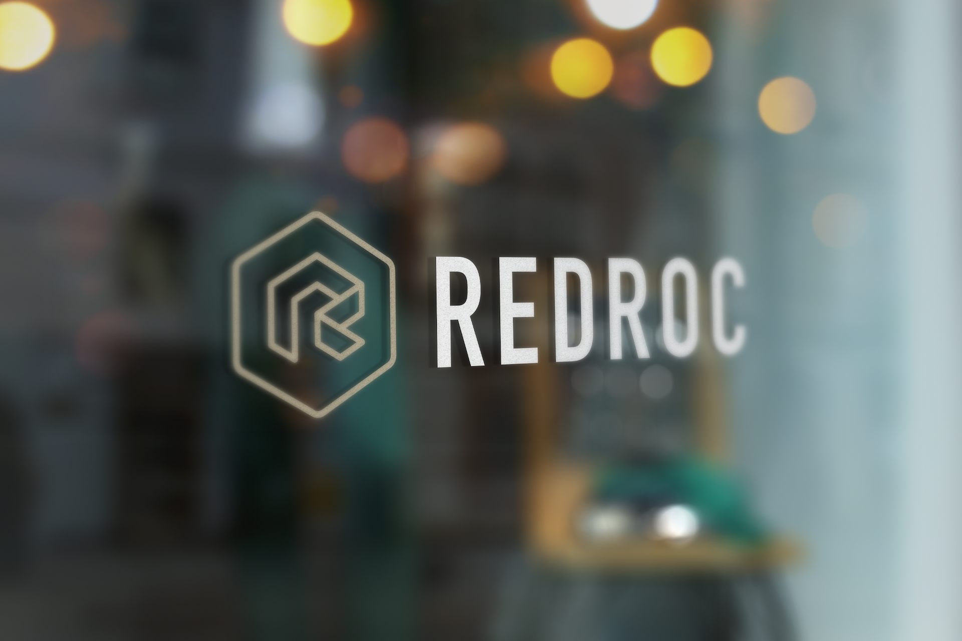
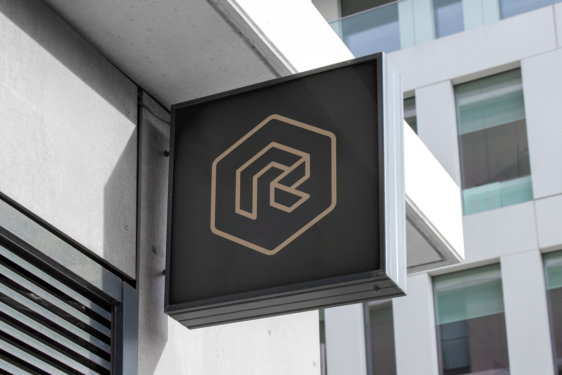
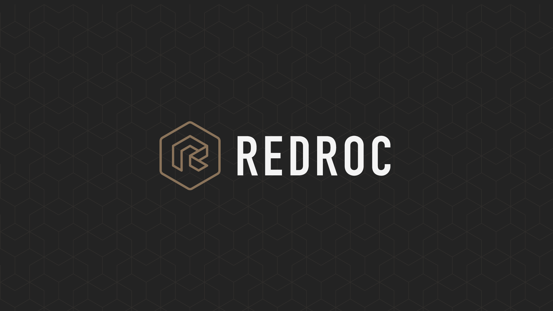
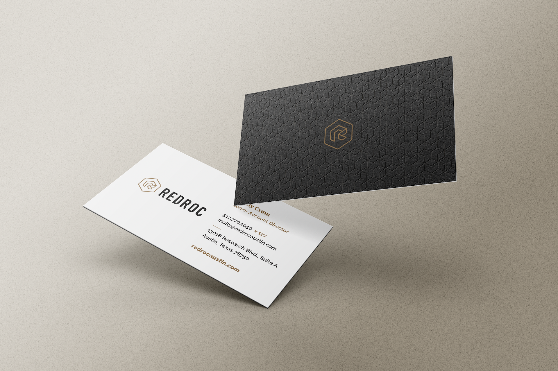
My objective was to craft a recognizable logo that retained the simplicity of it’s original stylized letter-form, while also allowing the design to hint at much more. My hope was that the final design would have a high level of visual sophistication and range to reflect the depth of the agency’s experience and multidisciplinary offerings.

Using a custom isometric grid and a thick, bold line weight the design was carefully constructed to produce an iconic look that evokes both simplicity and depth.
The subtle brilliance of the end result lies in this logo’s dynamic duality. At times, the shape appears strikingly two-dimensional, its facets seamlessly aligning to create a simple, flat polygon holding within it’s negative space; a stylistic letter made of ribbon.
Yet, with a subtle shift in perspective, the design transforms itself into a compelling three-dimensional entity. The ribbon seems to move, wrapping itself around the contours of a geometric cube.
The cube, a symbol of solidity and structure, is the heart of the design that, although completely invisible, is the reason for every aspect of the shape we see.
This interplay between 2D and 3D elements instills a sense of visual intrigue and versatility, mirroring the multifaceted nature of the agency this logo represents.
The thick, bold lines contribute to a sense of strength and clarity, ensuring the logo’s impact is both immediate and enduring. Overall, this design is a testament to the power of simplicity and nuance, offering a logo that is not only visually engaging but also capable of adapting to various contexts with seamless elegance.
The final logo appears to be both a two-dimensional and three-dimensional image depending on what your eye catches first. The act of allowing yourself to slightly shift your perspective with intention is representative of what the talented team at Redroc does every day.
The agency prides itself on coming up with “out of the box” ideas and solutions that produce predictable and measurable results for their clients. The
Bringing the logo to life with a sleek and stylistic animation.